The Widget tab allows you to configure the functionality of the app. As widgets are specifically designed to work with 2D or 3D data content, a set of widgets for 2D apps is different from 3D apps. In addition, the initial set of widgets may vary from theme to theme, as each theme has its own preconfigured set of widgets. Following are the widgets from the Foldable theme when you build 2D apps.
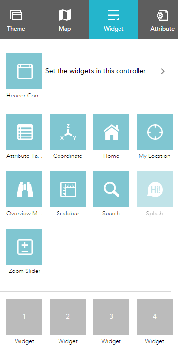
To configure a widget, click the Configure this widget button  to open the widget configuration window.
Off-panel and in-panel widgets
The preconfigured widgets may include both off-panel and in-panel widgets. The off-panel widgets for a theme display when the Widget tab is activated. They can be turned on or off by the eye icon  . The off-panel widgets that are not part of the theme can be added to the widget controller. The in-panel widgets can be removed or added from the widgets collection. There are two ways to add widgets from the widgets collection: by setting the controller widget or the placeholders.
Click Set the widgets in this controller to open the page for in-panel widgets. Click + to open the widget collection that allows you to select and add widgets to the application.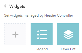
In the Choose Widget window, search for the widget or select one or more widgets. The selected widgets are highlighted in the blue boxes.

To reorder the widgets in the controller, click a widget and drag it to the location you prefer, wherever the red line appears.
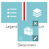
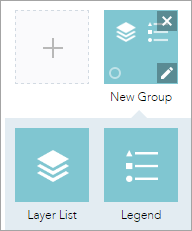
You can also group in-panel widgets by dragging one or more widgets into another widget. The grouped widget shows as a folder icon on the controller widget. To ungroup the widget, drag each widget out of the group.
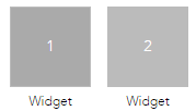
The placeholder is labeled by a number. Click it to open the widget collection window. Only one widget can be selected for a placeholder. Widgets added in the placeholders can be dragged onto the map. They also can be resized by dragging the lower right corner of the panel.
When the widget configuration completes, click Save.
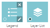
The widget added from the widgets collection can be set to open automatically when apps start. To do so, click the dot on the widget to change it to dark green. A maximum of two widgets can open automatically: one is on the controller and another in the placeholder.
On-screen widgets
On-screen widgets are those that display their icons within the map area. Usually, they include the preconfigured off-panel widgets from the theme and widgets in the placeholders.